Enough is enough!
Museums created by designers and architects who, consciously or not, disregard the principles of museum studies and the issues of accessibility.

It is already hard to endure an exhibition that disregards the exhibition principles painstakingly developed by museological studies. But when it comes to a museum—especially one anticipated for over 50 years and costing well over 10 million euros—I believe it is impossible to stay silent about the glaring issues in its realization.
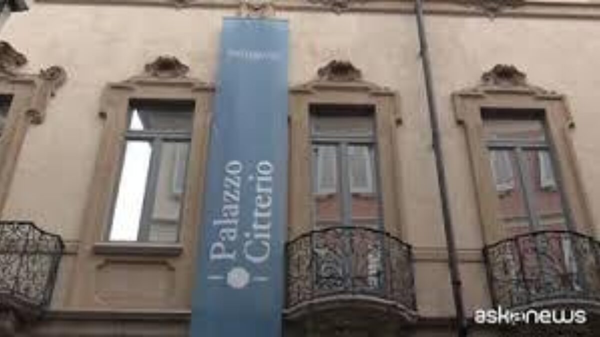
Palazzo Citterio, the long-missing annex (?) that was supposed to make Brera "Grande," has finally opened. Yet after 52 years, perhaps they could have waited a few more months and spent a bit more money to make it meet proper museological standards.
As it stands, the building and its interior design—I refuse to call it an exhibition setup, out of respect for all the architects who listen to museologists—is a beautiful space: aesthetically pleasing and evocative. It aligns with the approach of Palazzo Rovati, but what else can one expect from the same architect? Should they change their "signature style" to highlight the collections and their narratives? Sacrifice their ego to provide visitors with explanatory tools and clear interpretive keys?
I wonder where the Director and Deputy Director were when the renderings or at least the layout plans for the exhibition (yes, I’m forced to use this term for simplicity) were presented. Where were they when, once again, someone proposed unclear lettering on glass, non-existent signage, or—peak absurdity—lilliputian room panels requiring a magnifying glass? And the provincialism of these panels, with their even more illegible English translations? I don’t know how the New York Times had the courage to recommend visiting the Palazzo. Perhaps they hope necessary adjustments will be made in the meantime—or maybe Brera (sorry, I mean the GoB, the Grande Brera, with its teal octagon logo, a color utterly overused in recent years) simply has an excellent press office with strong international connections. At least that's one good thing!
It is truly disheartening to work daily to promote the role and value of museums, only to encounter a missed opportunity of this magnitude. And to be clear, I’m not talking about the content or the collections. I’m staying within my role as a museologist: I’m addressing accessibility and visitor experience.
It’s obvious that after 52 years, Milan’s cultural elite—what’s left of it—and flâneurs and enthusiasts rushed to visit Palazzo Citterio: to literally get lost starting from room 40 onwards, to wonder about the purpose of a semi-dark, semi-empty library room that’s beautiful but... to roast in the heat because there’s no cloakroom and the heating is set too high, to struggle to read the panels and captions, and to find no tools to assist those who might need them (some panels are tilted so steeply that someone in a wheelchair couldn’t possibly see, let alone read them; some captions feature item numbers for dozens of objects as small as a pin). Why are there two overlapping decorative layers on the walls in certain rooms? Why were they left there? To which periods do they belong? What were the functions of those rooms?
We museologists talk so much about the multi-layered stories that a museum can offer visitors—engaging them, immersing them, making them care about the place and its richness. Here, we have only the ostentatious and the superficial. And the few Louis XIV chairs—which, for non-experts that are unwelcome at Palazzo Citterio, are Philippe Starck’s overhyped plastic chairs for Kartell—aren’t for visitor seating. No, for that, there are two small armchairs in a dark corner and a single row of garden chairs in front of La Fiumana. If visitors want to rest, they must go outside to the freezing wooden temple in the courtyard. Or sit on the stairs.
No. We can’t do this. We won’t do this. And so, I ask myself: does it even make sense to keep talking about accessibility and museological standards?


